Modernism and my abstract exercise
In Design Anthropology class, drawing feelings is an exercise students have to practice extensively, right from the first day at class. At a glimpse, it seems to be an impractical exercise, but is it really?
We are living in a new era of graphic design, and 90% of today’s designers are modernists. We are often taught that good designs are meant to be legible, readable, and useful; clearly, this has become a lodestar for the new contemporary design trend. That is totally true, but not enough. The roots of modernism are much deeper-implanted.
First, let’s have a look at history before the birth of Graphic Design. When the world had not forged this industry, when artists were still wandering around the world’s wonders, or sometimes, their own, to produce landscape arts, portraits and still-lifes as lively as possible. The artists would have just, perhaps, continued such work, had it not been for the emergence of a new perspective, one which altered the face of art at the time, paving the way for Graphic Design.
Classical arts of the 18th century
At the end of the 19th century, the world’s natural science welcomed a breakthrough. Scientists kept discovering invisible forces, such as the infrared light, X-ray, electric field, etc. (Voss, 2013). A bold question came up to the artists: “What if we could depict not just those things, but the forces around them as well? What if we draw not only a person trembling with fear, but also the very fear itself? What if we draw not only an instrument, but also the music?” Questions like these keep spinning around in the artists’ heads, leading to the birth of a new form of art: Abstract Art.
One of the first artists to practice Abstract Art was Wassily Kandinsky – a Russian artist. He drew his feelings based on geometric shapes.
“Of all the arts, abstract painting is the most difficult. It demands that you know how to draw well, that you have a heightened sensitivity for composition and for colors, and that you be a true poet. This last is essential.” – Wassily Kandinsky
Wassily Kandinsky abstract paintings
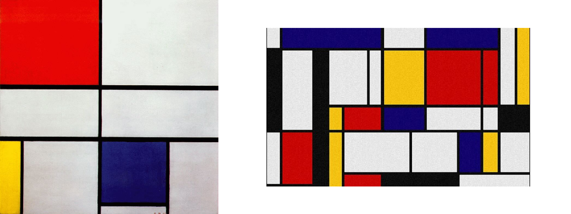
Another noted artist of this time was Piet Mondrian, De Stijl’s co-founder, one of whose quotes is: “Art soars higher than reality, yet without a direct association to reality. To approach the soul of art, we employ the realistic elements as little as possible, for reality is the soul’s opposite. We see ourselves in an abstract artwork. Art has to rise above reality, otherwise it bears no value to man” (Seuphor, 1956). De Stijl has become a name to call a school of art, and is still being taught in design/art programmes today.
Piet Mondrian paintings
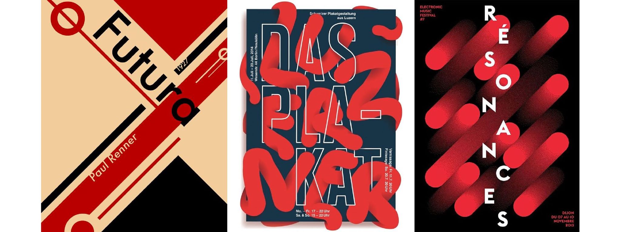
Following Abstract Art’s advancement, we can anticipate the birth of Graphic Design. Wassily Kandinsky spent a time teaching at Bauhaus, taking along theories on art perception, like shapes, colours, etc., exposing them to the world’s first graphic designers. It can be said that Graphic Design is the child of Abstract Art, and so, it retains its parent’s traits. Look at logos – they are Abstract Arts. Even a novice designer knows, in making a logo for a car brand, drawing a car is advised against, or when making a logo for a perfume brand, one should not draw a bottle of perfume. What we should grasp is not the object, but its soul. Another example is posters – if you separate a typographic poster’s visual elements, shapes from text, and look back, we will see the abstract pictures.
Modern typographic posters are just abstract paintings
The whole picture of typography, shapes, colours, etc. are all feelings. This kind of exercise is still widely applied in major Art Universities because of its profound simplicity. As time goes by, modernism is on the increasing reduction of visual elements, which challenges graphic designers’ perception capability even further. Wassily Kandinsky has a great saying, which has become the teaching inspiration for Design Anthropology:
“The artist must train not only his eye, but also his soul.”
I can proudly say, Design Anthropology students all finished the course with a gorgeous soul.
An abstract painting session in the class


